Guest post contributed by: Mathew Reeves
The online form is an essential conversion point for many businesses, especially for eCommerce websites.
While most online ventures put a significant effort into building a solid SEO foundation, making their sites trustworthy and speed optimized ones, they fail to realize that the form design is the last hurdle that makes or breaks the overall conversion rate.
Think of it as a distinct “signature,” both figurative and literal, that shapes the user experience (UX).
For that reason, most business owners opt for a professional custom design agency to optimize their visitors’ on-site journey.
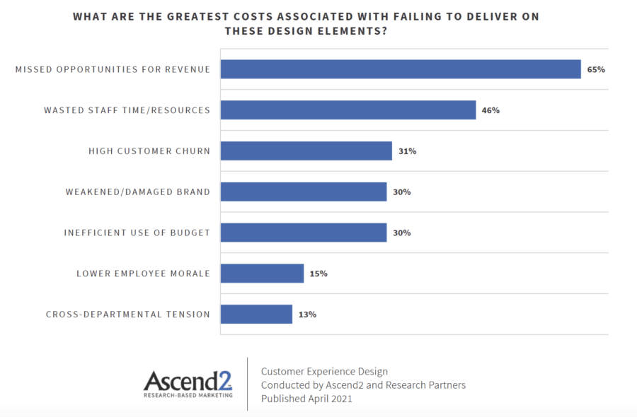
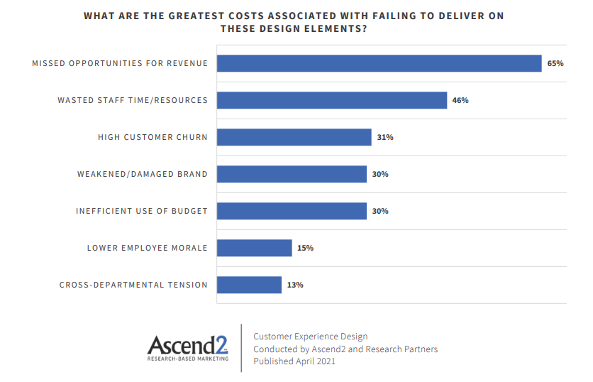
What is the impact of ineffective design? An Ascend2 study found that missed opportunities for revenue is #1 on the list.
Why does form design matter and why should you implement it on your website?
In short, you need to provide your visitors a way to sign up for an account, purchase the desired product and/or service, etc.
Ascend2 research reveals that contact form optimization MUST be centered on the UX design principles, be it a registration or shipping form, survey, feedback, or the simplest email sign-up.
An eye-pleasing design is just the first step, so we’ve listed the 12 proven ways to enhance your form design and boost conversions.
Simple and Easy-to-use Form
Web forms are critical conversion points, so you want to make them easy-to-use, professional and sleek.
If a form asks for too much information, it raises a few red flags for your visitors, which in turn means losing submissions and conversions. When it comes to information, try to ask for the bare minimum.
Lose the unnecessary fields and concentrate on crucial: who, what, how, where.
What is considered aesthetically appealing varies from person to person, but A/B testing should help you determine what works best for targeted customers.
Generally, clean forms with large fonts, few fields, and single-column layouts work best.
Minimize User Effort
An average user wants to put in as little effort as humanly possible. What does that mean?
The number of fields in a form has a significant effect on the conversion rate. If the perceived experience of filling out the form seems tiring and time-consuming, your visitor will likely abandon the whole process.
When possible, utilize checkboxes, drop-down menus and radio buttons.
Start it Lightly – From Easiest to Hardest Questions
Once your visitor starts filling out the form, they show commitment. If you want them to convert, start with the easy questions, including name, email address, phone number, etc.
Once they’re halfway there, you can fit in the more time-consuming stuff, including billing and shipping options.
Luring them in, so to speak, and then appealing to their invested time is the key.
Mobile-friendly Design
It’s a well-known fact that mobile conversions are less than half the rate of their desktop counterpart. However, as Bob Dylan would put it, “The times they are a changin” and the current trend is soon to be turned on its head.
As the number of mobile users globally is projected to hit seven billion by the end of 2021, mobile-friendly (or thumb-friendly, to be more precise) form designs should follow accordingly.
With a mobile-friendly form design, your visitors can easily view your site on any mobile device, as all of the information scales to screen size.
However, web design and mobile app development can be daunting, but with an experienced team, you can knock them out.
Label Form Fields
To speed up form completion, it’s advisable to place labels above the input fields, making them easily scannable at first glance. Studies have shown that this layout contributes to minimizing user effort and it best matches natural eye movement.
A different approach is to label only the optional fields. That way, your users are subconsciously aware of the individual field importance, but they’re more likely to voluntarily fill out optional fields as you’re presenting them with a meaningful choice.
Use Inline Form Field Validation
Inline form field validation is a process in which your visitor’s information is reviewed in real-time as they’re filling in the form.
Suppose users fill out a field incorrectly, with an invalid email address, credit card number, or simply make a typing mistake. In that case, an error message appears below or inside that field, informing them of the error so they can resolve it and move on.
Remember, nothing is more annoying than finishing with a form, only to be notified of the potential mistakes afterward.
Explain the Need for Personal Information
People are justifiably hesitant to share their personal information when filling in forms, especially when phone numbers and/or addresses are required.
Those who question the need for sharing personal info are, more often than not, immediately abandoning the form, or even worse – they fill in false information.
Psychologically, sharing anything personal ignites a “fight or flight” emotional response. To mitigate it, you need a good reason to ask for private information, which should be communicated to your visitors clearly, for example, by using the infield information button.
It should explain why you need that sensitive data to create trust, which further turns initial concerns into potential conversions. Personal information allows you to provide a personalized experience for your visitors.
Be careful when asking for Phone Numbers
It may sound contradictory to some of the previous points, but avoid asking for phone numbers unless it’s absolutely critical to your business model. Almost 40% of visitors abandon sign-ups when a phone number is required.
You may cleverly avoid this setback by requesting an email, make a phone number optional, or better yet, setting a contact field with a couple of options for visitors to choose from. If your sales team heavily relies on call center services, you might consider using phone numbers as your primary contact info, rather than email.
Copy and Paste Feature
Some online forms don’t allow the users to copy/paste information. Although understandable, it’s not the best course of action if you want to boost your conversion rate.
Visitors find it convenient, but also, by copying and pasting information, they avoid any spelling errors.
Auto-fill Browsers
Browsers like Google Chrome and Firefox have autofill features that pull past information from the cache memory and browsing history to complete specific form fields.
To fully utilize it, it’s advisable to title each field with a common term/attribute that most popular browsers can recognize to help speed up the visitor’s form completion process.
Avoid Captchas
“I am not a robot.” It’s strange how this sentiment became a standard part of the everyday online sign-up experience. Captchas are used to deal with bots and spam, but even though they are fairly efficient, they’re often viewed as unnecessary obstacles to online form visitors.
You may think that one more step when filling out the form is a small price for a security and spam umbrella, but your visitors might not appreciate it.
In fact, studies have shown that failure to complete a captcha causes major user frustration. We can all relate to that feeling. It directly feeds abandonment rates.
Add Clear CTAs
Calls-to-action (CTAs) are essential. They must appear as a distinctive button in the form. Refrain from using the usual “sign-up,” “submit,” or similar lackluster solutions, but rather opt for creative and engaging solutions such as “Get to Know Us,” “Subscribe Me Now,” etc.
As we said in our first tip, it’s always recommended to conduct A/B tests until you find the perfect CTA.
As far as design goes, the CTA button MUST capture your visitor’s attention. It should “pop” with a contrasting color. You don’t want your visitors to miss it, so make it the focal point of the form.
Conclusion
There are no great revelations as it’s all about the user experience. Simplicity is what wins the day, but simplicity is often the hardest to achieve.
Making efforts to improve your form UX will organically result in satisfied users, more form completions, and finally, a higher conversion rate.
Author Bio:
Mathew Reeves
Experienced in Online Marketing, Mathew writes for business and for pleasure, mostly focused on digital trends and web design. A huge people person, passionate about travel and books. Allergic to poor internet connection.